Why Rosie's Book?

While growing up, I had a dear friend, Renee, that lived next door and with whom I spent much of my childhood. We grew, in different directions, and went on our merry way. Many years later, I ran into her parents and they kindly reminded me of the laughs they still have over my book. “What book?” I wondered with a puzzled look. "I don't remember a book." Hardy laughter accompanied their response. At some time during our childhood, I tried to convince Renee about something that her parents didn’t agree with. I told her that proof of its truth could be found “in my book.” Naturally she went home and tried to convince her parents of the same thing but they weren’t falling for it. She needed an edge and told them emphatically, “It’s in Rosie’s book!” After they caught their breaths from reborn laughter, they let me know how “Rosie’s book” has been cited for many other things throughout the years. They’ve also mentioned that they’d like to see “Rosie’s book” one day. I can’t remember all of the things that I said were in “my book” but I’m sure my dear friend’s parents can recall much more than I ever knew about – LOL!!! So, here it is . . . my version of things you might find In Rosie’s Book . . .

Showing posts with label Paper Temptress. Show all posts

Friday, May 24, 2013

Elisabeth Bell's Little Mama Digi Bells' Blog Hop

To celebrate the newest addition to Elisabeth Bell's Digital Gallery (here), the Digi Bells Design Team is hosting a blog hop.

How can you win your own Little Mama digi image? You'll have to hop through and leave comments on EACH blog. [You can find the full list of 13 other blogs at the Digi Bells Design Team blog (here).] Lynda will pick 2 blogs at random and the winners will be picked from those comments. The hoppers will have until Friday, May 31, 2013 at 9 AM to leave comments. The winners will be posted at the Digi Bells' blog on Saturday, June 1, 2013.

Reminder: Buying then sharing digital images is theft. Sharing digital images takes income away from the artist.


* * * * *

I've used the newly released Little Mama digital stamp by Elisabeth Bell on an easel card.  This view shows a closer view of my Copic-filled image.


I've layered Bazzill cardstock with an unmarked purse and luggage patterned paper to create my card.  Faux stitching adds a contrasting border while a Wrights' 3/4" pearl lace strip border grounds my image.  Bo Bunny's Crazy Love glitter Brads line one corner of the front and base.  A digital stamp from a Crissy Armstrong Maya Blowing Bubbles Sentiment A2 Size set is printed on Paper Temptress Cryogen paper and is accented with a flower button tied with a twine bow.  Cheery Lynn Designs Mini Fanciful Flourish die cuts lie below a Recollections Mulberry Paper Flower and Mini Roses.

Here's a view of the front of my easel card showing my use of Elisabeth Bell's newest digital release called Little Mama.


I've left the base blank for placement of a stamped sentiment or handwritten note later.


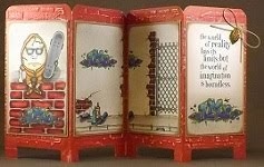
This view shows my easel card, open and ready for display . . .


Remember to leave your comment below then move along to your next stop at the wonderfully-talented Susan's blog (here). For reference, you can find the full list of the blogs to hop at the Digi Bells Design Team blog (here).


I'm entering this card into the following challenges:
Crafty Catz "A Fancy Fold or Two" (here)
Totally Paper Crafts "Buttons" (here)
Wags 'n Whiskers "Anything Goes" (here)
Dream Valley "Animals" (here)
Crafty Sentiments "Buttons" (here)
Sweet Stamps "Anything Goes with SweetCuts or Cheery Lynn Designs Dies" (here)
Fab 'n Funky "Ribbon and/or Lace" (here)
Whimsy Stamps "Anything Goes" (here)
Cute Card Thursday "Tie it Up" (here)
Elphine House Australia "Die Cuts and Layers" (here)


Copics used:
skin - E000, E01, E11, E93, BV00
hair - E31, E35, E47
heart, bangles, hairbow, shoes - V20, V22, V25, V28
dress - YG91, YG95, YG97
cat, purse - YR21, YR24, YR27
ground shadow - W5, W3, W1, W00
airbrushed background - YR21, YG91, V22


As always, I'm so glad that you stopped by to visit!

~ Rose

Wednesday, September 7, 2011

Crafts and Me Challenge: Buttons and Bows

The Dynamite Digi design team at the Crafts and Me Challenge blog wants to see your buttons and bows.  Crafty Ribbons is sponsoring this challenge and offering your choice of a back-to-school or cherry pick ribbon set as a prize to a randomly selected winner.  You can find out more about this challenge and their sponsor here.

I've used this beautiful, newly released Hannah Lynn steampunk image named Miss Mirabelle.  She's using old world futuristic goggles to hold her hair back.  Her metal wings are piped into place.  It seems appropriate to dress her in a silver metallic suit.  This photo shows a close-up of my Copic-filled Miss Mirabelle image.


I've created a money holder pocket card that should fit into a business sized envelope.  The card is 8 1/2" long x 3 5/8" tall and has a pocket inside to hold some cold, hard cash as a gift.  This photo shows how the inside of the card looks with an "empty" pocket.


I've layered some Graphics45 Steampunk Debutante Modern Marvels papers with Bazzill cardstock.  Sizzix Tim Holtz Alterations On The Edge Steampunk adds some bordered gears.  I've included some Spellbinders Donna Salazar Sprightly Sprockets die cuts using Paper Temptress Copper Ore and Glamour Gold Glossy with Paper Cut's Metallic silver cardstock and StarDream's Bronze Metallic text papers.  Those papers have also been punched with Punch Bunch leaves, small blossom and mini flower to coordinate metal-looking flowers with a Bazzill Basics walnut gem in the center of each.  A Bazzill Basics Vintage button is centered over the ribbon double bow.


As steampunk is the idea of celebrating the future of yesterday, I've included this Victorian text sentiment from the Crafty Secrets Medium Mouse Party set.  EK Success Jolee's Boutique has recently released a line of Steampunk layered stickers like the Gear Corners I used on this sentiment.


This photo shows my completed card demonstrating Hannah Lynn's Miss Mirabelle image and my attempts at providing her with an appropriate steampunk'd base.  I'm really lovin' the look of those Tim Holtz idea-ology Adornments Regal wings extending Miss Mirabelle's wings from the image to the rest of the card.


I'm entering this card into the following challenges:
Charisma Cardz "Anything Goes" (here)
Cute Card Thursday "A Pinch and a Punch!" (here)
Paper Play "Make Your Own Flowers" (here)
Moving Along with the Times "Handmade Flowers" (here)
Emerald Faerie Garden "Buttons" (here)
Crafty Purple Frog "Birthdays" (here)
Paper Crafting Journey "Sketch by Jackie" (here)
One Stitch at a Time "Use a Digi" (here)
Secret Crafter "Colors of Autumn" (here)
Craft Your Passion "Anything Goes Add a Flower" (here)

Copics used:
skin - E000, E01, E11, E93
hair - E31, E35, E47
gold - Y13, Y26, Y28
silver - C1, C3, C5
copper - E02, E33, E37, E39
eyes - BG93, BG96, BG99
outline shadow - BG99


"Top 3" Sept. 15, 2011 Paper Crafting Journey

Sunday, June 5, 2011

Card Art with Copics: Crafts and Me Forest Friend

The Crafts and Me digi design team wants to see your punch art.  The Crafty Purple Frog is sponsoring this challenge and offering three digi decoupage sheets of Ching-Chou Kuik's fantasy art work.  Find out more about this challenge and their sponsor here.

I'm thrilled to share one of two images that I won for commenting during a recent blog hop through the Crafts and Me design team blogs.  This fabulous Forest Friend image is a Sara Burrier digi image made available exclusively by Crafts and Me.

This Forest Fairy seems very protective to me.  It also seems as though it could be very strong and perform its fairy duties with power.  I got the feeling of strength and encouragement while working with it and found this Inkadinkado sentiment appropriate.  Its unusual wings have a more foliage kind of look to them.  This photo shows a close up view of my Copic filled Forest Fairy image . . .


In order to fit the image onto my matting, I had to cut around parts of the wings.  While cutting I altered them slightly allowing more room for coloring in places.  Using a black Copic Multiliner BS around the paper core edges of the cut out wings makes them appear more complete.

I used a Fiskars read between the vines border punch with super shimmering Paper Temptress mica/metallic Juniper Berry for my card base.  Paper Temptress' Cappacino/Grape Sorbet, Olive/Brown Bag and Amber mica/metallic provide additional matting for my image.

EK Success' medium and small daisy punches with a Punch Bunch mini flower and sun provide coordinating paper punched flowers.  McGill's pine branch punches painted with Diamond Stickles provide nice filler between the flowers.  I added a drop of Golden Rod Stickles to the center of each flower.  A few Marvy 1" and 3/4" circle punches provide a base for the flowers.  This photo shows a close up of just my handmade, coordinated paper flowers using punches and Paper Temptress papers.


Here's a pic of the completed card front and my entry for the current Crafts and Me punch art challenge.


I enjoyed working with this fabulous Sara Burrier Forest Friend image and look forward to using it again soon.

Copics used:
skin - E000, E01, E11, E93, BV00
hair - E31, E35, E47
clothes - E70, E74, E79
wings - BG75, BG72, BG70, Y28, Y26, Y21, E44, E42, E40, R24, R22, R20
airbrush sky - BG72
airbrush ground - E44, E43

Tuesday, April 19, 2011

Card Art: Magical Marquee PeekABoo Gatefold Card

I began with the intention of making a simple gatefold card.  Instead, it turned into a Magical Marquee Peekaboo card as inspired by Janine Tinklenberg in a 2010 version of Interactive Cards.  Check it out!

This little bunny fellow and basket are part of a Close To My Heart Sensational Season March 2011 Stamp of the Month set.  I deliberately filled them using my Copics to flat color.  It sure was difficult not to add shading and blending and all of those other wonderful things that Copics can do.  I need a good sample of how simple, flat coloring looks for comparison with those more technique-oriented projects.


Paper Temptress has a great line of double-sided double-colored cardstock. I've used a sheet of the Cappuccino/Grape Sorbet. The outside of my card is a medium brown but the inside is a beautiful light shade of lavender. How great is that?!?!  Two for one!

This photo shows the completed card front.  A little doodling with the Inkssentials Opaque White pen provides a simple border.


I slipped a piece of Amber Mica/Metallic into the center of the inside to contrast with the shade of purple. I stamped the sentiment from an Art Gone Wild! Chocolicious stamp set using Memento Tuxedo Black and this shimmering paper accepted the ink so nicely without smearing.
 
Here's how the inside looks when opened.  The "Easter Joy" saying that shows up when the card is closed, moves to the side and an image of a chunk of chocolate decadence is revealed.  Cool, huh?
 
 
This card was fun to make especially after seeing how the paper engineering works.  I had to make some adjustments and substitute as I didn't have all the right tools.  This card will definitely serve its purpose as a good sample of flat coloring with Copics.

This strong paper from Paper Temptress is really exceptional for making interactive cards!  I really want to mention that when holding this card, feeling the weight and firmness of this paper, it's obvious that I've used very high quality papers.  I'm sure that the recipient of a project made from Paper Temptress papers would immediately recognize the efforts put into a very special handmade gift by someone who takes a great deal of pride in their work.  This card is quite pleasing to touch and confirms that using quality materials produces quality finished projects.
 
Copics used:
cherry R37
ice cream E71
chocolate sauce E79
icing E49
cake, bunny, basket E13
whipped cream N1
basket grass YG25
bunny ears E93
bunny coat B24
eggs Y21, BV13, R85, YR02, V12, E04

Friday, April 15, 2011

Copic Creations Challenge: Your Favorite Paper for Copics

At the Copic Creations Challenge blog, the design team is currently showcasing their use of Copic markers on Cryogen white paper. The sponsor of this challenge, the lovely Patricia of Paper Temptress, is offering a very generous $25 gift certificate to the Paper Temptress store as a prize to a randomly selected entry. Find out more about this challenge and sponsor here.

Paper Temptress provides a fabulous range of gorgeous high quality papers in various colors, metallic to iridescent, smooth to textured, light to heavy gauge. I’m especially interested in seeing how Copic markers work on Cryogen White paper. With an 89 lb. cover weight, Cryogen White has a subtle sparkling surface and its mica coating shows an elegant luminescent sheen on both sides of the sheet. It is acid-free and compatible with laser and ink jet printers.

Here are the results of my first attempt at using Copic markers on Cryogen paper . . .

I've printed this digital image of a Gothic Fairy from the 2010 book Fairies Art Studio by David Riche’ onto Cryogen paper using my Epson Stylus Photo R1800 printer.  The printing is crisp and clean and shows no sign of smearing.  Great start.


If you're able to click on the photo above and enlarge it, you can see how the shimmer of the Cryogen paper shows even through the layers of Copic color.  Well, you can't see the amazing shimmer exactly, but all of those teensy-tiny white dots throughout the wings and upper area is the mica shimmering.

While I love the remarkable shimmer and silky smoothness of this paper, it behaves much like the X-Press It! blending card and glossy cardstock for me when I apply my Copic marker ink.  If you like X-Press It! blending card then you'll like Cryogen white paper.  There is little to no ink bleeding through to the other side.  I didn't have any problem with the color feathering beyond the lines of my image.  As the marker color remained on the surface of the paper, I was able to easily remove any misplaced color with just a swipe of the Colorless Blender.

The humidity levels in my area of New Jersey effect paper differently than the environment in other parts of the world. I have found that Cryogen paper does not allow me to use my normal application of light layers with Copic markers. The ink dries so quickly on this paper’s surface that my layered strokes remove the previously applied ink from the newly formed ink-puddles. Colorless Blender techniques are ineffective because the ink removed from the surface stays on the marker tip of the Colorless Blender rather than allowing the Colorless Blender to push, fade or erase the applied color. For the most part, one stroke is all I get on this paper. When I remove my marker tip from the surface, streaks form.


To embellish my card, I've added a border of pleated black lace, a couple of Sizzix 3d Flowers and Punch Bunch blossoms.  Silver nailheads adorn a computer generated quote die cut with Spellbinders Floral Doily Motifs.


I used a QuicKutz pirate flag die for the skull and cross bones to create airbrushing masks.  Spellbinders Labels 8 shapes the Cryogen white and Black Crepe matting.  I attempted to use a few dabs of Diamond Stickles for sprinkled fairy dust.

Here’s the completed card that shows my use of layers of superior quality paper from the Paper Temptress as well as my use of Copics on Cryogen Paper to fill this cool Gothic Fairy image.


You have until April 30th to show us your best work using your favorite paper for Copics. Why not give Cryogen white paper a try?

Copics used:
skin - E000, E01, E11, E93, BV01
hair - Y21, Y23, Y26, Y28
leather dress/boots - T0, T6, T9, 0
silver straps - C1, C3, C5
rose - R22, R59, G82, G99
wings/rose ribbon - V91, V93, V95, V99
airbrush - C3, R22, V93, Y23