Easy is good. I like easy.
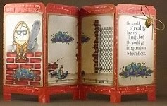
Sizzix has a die for the Big Shot Pro that will cut and score a Tri-Shutter Card in a jiffy. Easy peasy! Easy is good.
I used My Mind's Eye Lost & Found Market Street "Happy Birthday" Dictionary Paper and within a few seconds I had a fabulous double-sided Tri-Shutter card ready for decorating. This paper is already vintage-looking so I just added some dark brown cats eye ink to the edges.
I stamped my Magnolia Birthday Tilda from the 2011 You Are So Special collection and filled her using coordinating Copic colors. I'm not a big pastel kind of person but I had to coordinate with the lighter paper colors. Here's my somewhat pastel-colored Tilda . . .
I stamped an Art Gone Wild! sentiment from a Birthday View Maker set and cut it out using Fiskars postage stamp scissors. I added a gift stamp from Impression Obsession's Festive Birthday set and a couple layered scalloped circles and blocks of paper. Some Bitty Sparkles add glimmer.
This photo shows the open Tri-Shutter card from slightly above . . .
Here's a more natural view of the open card . . .
When open, this card is 5 1/2" tall and 11 1/4" long. When closed, it's just 3 3/4" wide so it'll fit nicely into an A2 size envelope.
The current Crafts and Me challenge is to create something vintage-looking and/or distressed. They're offering a Sweet Pea Stamps Caribbean Treasure stamp to a randomly selected entry. Find more about this challenge here.
Copics used:
skin - E000, E01, E11, E93, BV00
hair - E31, E35, E47
dress - R000, R01, RV42
socks, bow - YG61, YG63, YG67
shoes - T0, T6, T8
chocolate cake - E71, E77, E79, atyou Spica garnet
candles - BG23, BG0000, E53, Y13
doily - B0000, 0
Wednesday, April 27, 2011
Sunday, April 24, 2011
Zentangle-inspired Sizzix Big Shot Pro Bag with Handles
I'm looking forward to our family gathering for our Easter Breakfast meal and want to include a small candy filled favor at each place setting. In comes the Sizzix Big Shot Pro Bag with Handles.
I printed my previously scanned Zentangle-inspired art on both sides of plain white cardstock. The Sizzix Big Shot Pro Bag with Handles made it so easy to die cut the shape of this perfectly sized favor bag. The scored lines made it simple to adhere the tabs.
Double-sided printing allows the inside of the bag to showcase tangles too.
In just minutes, I was able to add a little Easter grass filler and several varieties of individually wrapped chocolates.
A simple bow of ribbon tied around a handle adds a sparkle. This pretty little favor bag will likely be a great conversation piece for our gathering.
May your Easter be overflowing with sweetness! Enjoy!
(You can find my other Zentangle-inspired Sizzix Big Shot Pro projects here and here.)
Tuesday, April 19, 2011
Card Art: Magical Marquee PeekABoo Gatefold Card
I began with the intention of making a simple gatefold card. Instead, it turned into a Magical Marquee Peekaboo card as inspired by Janine Tinklenberg in a 2010 version of Interactive Cards. Check it out!
This little bunny fellow and basket are part of a Close To My Heart Sensational Season March 2011 Stamp of the Month set. I deliberately filled them using my Copics to flat color. It sure was difficult not to add shading and blending and all of those other wonderful things that Copics can do. I need a good sample of how simple, flat coloring looks for comparison with those more technique-oriented projects.
Paper Temptress has a great line of double-sided double-colored cardstock. I've used a sheet of the Cappuccino/Grape Sorbet. The outside of my card is a medium brown but the inside is a beautiful light shade of lavender. How great is that?!?! Two for one!
This photo shows the completed card front. A little doodling with the Inkssentials Opaque White pen provides a simple border.
I slipped a piece of Amber Mica/Metallic into the center of the inside to contrast with the shade of purple. I stamped the sentiment from an Art Gone Wild! Chocolicious stamp set using Memento Tuxedo Black and this shimmering paper accepted the ink so nicely without smearing.
Here's how the inside looks when opened. The "Easter Joy" saying that shows up when the card is closed, moves to the side and an image of a chunk of chocolate decadence is revealed. Cool, huh?
This card was fun to make especially after seeing how the paper engineering works. I had to make some adjustments and substitute as I didn't have all the right tools. This card will definitely serve its purpose as a good sample of flat coloring with Copics.
This strong paper from Paper Temptress is really exceptional for making interactive cards! I really want to mention that when holding this card, feeling the weight and firmness of this paper, it's obvious that I've used very high quality papers. I'm sure that the recipient of a project made from Paper Temptress papers would immediately recognize the efforts put into a very special handmade gift by someone who takes a great deal of pride in their work. This card is quite pleasing to touch and confirms that using quality materials produces quality finished projects.
Copics used:
cherry R37
ice cream E71
chocolate sauce E79
icing E49
cake, bunny, basket E13
whipped cream N1
basket grass YG25
bunny ears E93
bunny coat B24
eggs Y21, BV13, R85, YR02, V12, E04
Friday, April 15, 2011
Copic Creations Challenge: Your Favorite Paper for Copics
At the Copic Creations Challenge blog, the design team is currently showcasing their use of Copic markers on Cryogen white paper. The sponsor of this challenge, the lovely Patricia of Paper Temptress, is offering a very generous $25 gift certificate to the Paper Temptress store as a prize to a randomly selected entry. Find out more about this challenge and sponsor here.
Paper Temptress provides a fabulous range of gorgeous high quality papers in various colors, metallic to iridescent, smooth to textured, light to heavy gauge. I’m especially interested in seeing how Copic markers work on Cryogen White paper. With an 89 lb. cover weight, Cryogen White has a subtle sparkling surface and its mica coating shows an elegant luminescent sheen on both sides of the sheet. It is acid-free and compatible with laser and ink jet printers.
Here are the results of my first attempt at using Copic markers on Cryogen paper . . .
I've printed this digital image of a Gothic Fairy from the 2010 book Fairies Art Studio by David Riche’ onto Cryogen paper using my Epson Stylus Photo R1800 printer. The printing is crisp and clean and shows no sign of smearing. Great start.
If you're able to click on the photo above and enlarge it, you can see how the shimmer of the Cryogen paper shows even through the layers of Copic color. Well, you can't see the amazing shimmer exactly, but all of those teensy-tiny white dots throughout the wings and upper area is the mica shimmering.
While I love the remarkable shimmer and silky smoothness of this paper, it behaves much like the X-Press It! blending card and glossy cardstock for me when I apply my Copic marker ink. If you like X-Press It! blending card then you'll like Cryogen white paper. There is little to no ink bleeding through to the other side. I didn't have any problem with the color feathering beyond the lines of my image. As the marker color remained on the surface of the paper, I was able to easily remove any misplaced color with just a swipe of the Colorless Blender.
The humidity levels in my area of New Jersey effect paper differently than the environment in other parts of the world. I have found that Cryogen paper does not allow me to use my normal application of light layers with Copic markers. The ink dries so quickly on this paper’s surface that my layered strokes remove the previously applied ink from the newly formed ink-puddles. Colorless Blender techniques are ineffective because the ink removed from the surface stays on the marker tip of the Colorless Blender rather than allowing the Colorless Blender to push, fade or erase the applied color. For the most part, one stroke is all I get on this paper. When I remove my marker tip from the surface, streaks form.
To embellish my card, I've added a border of pleated black lace, a couple of Sizzix 3d Flowers and Punch Bunch blossoms. Silver nailheads adorn a computer generated quote die cut with Spellbinders Floral Doily Motifs.
I used a QuicKutz pirate flag die for the skull and cross bones to create airbrushing masks. Spellbinders Labels 8 shapes the Cryogen white and Black Crepe matting. I attempted to use a few dabs of Diamond Stickles for sprinkled fairy dust.
Here’s the completed card that shows my use of layers of superior quality paper from the Paper Temptress as well as my use of Copics on Cryogen Paper to fill this cool Gothic Fairy image.
You have until April 30th to show us your best work using your favorite paper for Copics. Why not give Cryogen white paper a try?
Copics used:
skin - E000, E01, E11, E93, BV01
hair - Y21, Y23, Y26, Y28
leather dress/boots - T0, T6, T9, 0
silver straps - C1, C3, C5
rose - R22, R59, G82, G99
wings/rose ribbon - V91, V93, V95, V99
airbrush - C3, R22, V93, Y23
Wednesday, April 13, 2011
Card Art with Copic Fluorescents: Sweet Pea Stamps Dance of Butterfly
The current Crafts and Me challenge is to show use of ribbon. Whiff of Joy is sponsoring this challenge and offering a Miss Ladybugs stamp to a randomly selected entry. Find out more about this challenge and sponsor here.
The In A Sweet Pea Dream challenge is offering a $7 gift card for Sweet Pea Stamps to a randomly selected entry showing your favorite color. Find their challenge here.
Sweet Pea Stampers challenge is offering a $10 gift card for Sweet Pea Stamps to a randomly selected entry showing a card for Mother or Hero. Find their challenge here.
I've inked up my Sweet Pea Stamps Dance of Butterfly by Ching-Chou Kuik and stamped her onto Neenah Classic Crest Solar White 80lb cardstock then filled this beautiful image using my Copic Fluorescent colors.
Are you ready?
You're not going to believe this . . .
It's awesome . . .
I can't believe I made it myself . . .
Here she is, glowing under a black light . . .
I know! It makes you want to run out and get some of those Fluorescent colors, doesn't it? There are only 8 of them, thankfully. You can find out more about how much I love the Copic Fluorescent shades here, here and here.
This photo shows the full card front with the image framed in Offray 1/8" salmon ribbon. A few Creative Impressions small tropical iridescent blossoms and leaves with gold mini brads are at two corners. The sentiment is from Outlines Rubber Stamp Co.
Lights ON . . .
Lights OFF . . .
Gotta love it!!!
Copics used:
skin - E000, E01, E11, E93, BV00
hair - FV2, FB2, FBG2, FYG2, T6
tail - N1, FYR1, FRV1, 0
gold accents - Y13, Y26, Y28
butterflies - FY1, FYG1, FYG2
eyes - C3, C00, FBG2, FB2
bubble - G20, G21, G24
airbrush - BG11, BG13, BG15, V04
highlights - Opaque White
Saturday, April 9, 2011
Continuing A Love for Zentangle
There is something so incredible to me about meeting groups of people, guiding them through this simple and meditative art form called Zentangle, then admiring their final work.
This photo shows some Zentangle tiles created at a March workshop . . .
The tiles in this photo were completed more recently. On a fine Saturday in April, Sam invited some dear friends to her lovely home to introduce them to the Art of Zentangle. How fortunate I was to be there too!
Many of the magnificent Zentangle tiles shown in these photos have been completed by wonderful people who have never heard of Zentangle. Before their first tiles were completed, they wanted to learn more . . . in a much calmer way - LOL!!! Gotta love it!!!
Subscribe to:
Posts (Atom)