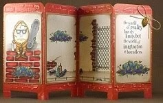
It makes me really happy when I try something new and it turns out so cool that I have to keep picking it up and looking at it. Here's one of those things. It contains paper techniques that I haven't tried before. I'll definitely be using these techniques again!
Interactive cards are fun to make and receive. I've seen some really nice pop-up cards and decided to give it a try. Easel cards are also fun to make and display (see my previous post here). Cards provide good surfaces for experimenting.
Keep in mind that I usually experiment by creating a "dud." My duds don't necessarily coordinate, they're full of imperfections and they're usually put together using scraps. I hang on to my duds for future reference so I can see where improvements can be made. This dud is almost gift worthy and definitely post-worthy.
To decorate the inside of my pop-up card, I used a piece of My Mind's Eye patterned cardstock. The tiny light blue dots cover a light background that won't distract from any writing on top of it. I cut my scored insert for a single centered pop-up. Wow! First try and it pops up just like it's supposed to. That was easy!
I adhered the cut insert to the inside of my card over some matting. Keeping it simple, I added a layered rectangle for my pop-up sentiment. The cardstock is really firm and sturdy so the card stays open on its own for displaying the inside of the card. Wow! This process is really very smooth.
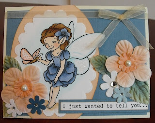
I picked up this Motivet fairy image at this week's Creating Keepsakes Convention in Valley Forge, PA and wanted to give her the spotlight. She's a little bigger than many of the nesting dies I have. I got most of her into the Spellbinders scalloped oval die but couldn't fit her wing inside. I placed the die over the image and pencil marked both sides of where the die met her wing. I cut around the part of her wing that extended beyond the die edge and cut a little further into the image so the die would slide under her wing. With her wing resting on top of the die's edge, I ran the image and die through my die cutting machine. Nice! I ran it through the machine again to emboss it. Oh, that's neat! You'll be seeing a lot more of that! It's a great effect that I've only done before using hand drawn templates.
I filled my fairy using B91, B95 and B97 to coordinate with the blue of my paper. I wanted to add some contrast and the opposite of blue is orange. My blues are very dark and dull so I tried to go for a peachy color and selected R12 for the butterfly wings. I used E53, E55 and E57 for her hair and pulled that into the butterfly's body and grounding at her feet. I used B000 to give her wings some transparency. B0000 with 0 gives a very soft, barely there, outline shadow.
I brushed some glue onto the fairy and butterfly wings and sprinkled some glitter over it. I'm happy that the wet glue brushed over the butterfly wings didn't react with the Copic marker dots to cause any feathering. That's good to know. I added a little more glue and glitter to the flower above the fairy's ear.
I rarely use flowers on my projects. It's not that I don't like flowers, I do. It's just that someone once told me that if I make a mistake on a project, don't worry, just cover it up with a flower. So, many years later, whenever I see a project with flowers all over it, I immediately think that there's a big, messy mistake under the flowers. LOL!!! I prefer to find embellishments that are related to the subject of my project. Sometimes flowers are the most appropriate embellishment. I think this fairy with a butterfly should be amongst flowers.
I buy white flowers and leaves whenever I see them. They're my absolute favorites because I know that I can add whatever color I want to match my project. Here I've taken some Prima frost leaves and airbrushed first with B97. Yep, I airbrushed blue leaves because I want them to coordinate with my blue paper and blue fairy. I applied a light top layer using BG93 to give them a little more greenish tone so they wouldn't look too outlandish.
I've airbrushed Bazzill tropical and bachelor white flowers using R12 to match the peachy tone of my butterfly. I added a pearl to each layered flower for a little glam. The additional Petaloo flowers with rhinestones seemed to coordinate well enough so I just added them as they were. I added more to the inside sentiment with the hopes that they'll help to pull it all together.
The fairy and sayings are from Motivet stamps. Check 'em out! They have nice, big, open image stamps that are good for filling with Copic colors. Comment on their blog (here) for a chance to win weekly prizes.
I hope that I've been able to reinforce how using Copics allows perfect coordination for all elements of your projects.
I'm not sure that this card will make it to the dud pile. I have to pick it up, take another look and think about it again. LOL!!!
Saturday, July 31, 2010
Tuesday, July 27, 2010
Quilled Things With Wings
I'm following up on my post about Quilled Insects and Other Creepy Things (here) by including more quilled things with wings. These quilled creations will grace my cards, scrapbook layouts and other papercrafting projects. They're really sturdy and I'm comfortable with using them on covers of mini albums even though I know they'll be handled regularly.
Quilling four small circles and one larger circle then pinching them into different shapes gives me all I need to piece together this little bluebird.
I also want to share with you that Denise from Custom Quilling in Cranford, NJ, is offering a $15 gift certificate as a prize that you might win if you take some time to tell her why you like quilling. Stop by her blog and say hello.
May you have lazy summer days filled with papercrafting joy . . .
Quilling four small circles and one larger circle then pinching them into different shapes gives me all I need to piece together this little bluebird.
The beginning shapes of circles, squeezed and pinched into teardrops, triangles, half-circles and squares can easily be seen in the different colors of these cute little bees.
This red and white butterfly is put together using quilled and husked pieces.
I attempted to add black spots to my ladybug's back by starting two of the circles with a little of a black strip and continuing the rest of the circle with red.
I also want to share with you that Denise from Custom Quilling in Cranford, NJ, is offering a $15 gift certificate as a prize that you might win if you take some time to tell her why you like quilling. Stop by her blog and say hello.
May you have lazy summer days filled with papercrafting joy . . .
Friday, July 23, 2010
Shading with Copic Fluorescent Markers
I have a Dover digital image of a wizard brewing something spectacular with the help of his tiny dragon companion. I want to convey the mood of fantasy, mystery and imagination. The color purple denotes mystery and intrigue. Purple is associated with royalty, spirituality, imagination and inspiration. I need that deep, bright bluish-purple, like a royal purple.
I immediately reach for my handy-dandy Copic Marker Hand Color Chart. (The marker cap colors are very deceiving and don’t provide a true value of the marker color.) Uh oh. I do not see an appropriate color after a quick look through the blue violets and violets. Hmmm. I glance at my blues and find that B79 Iris might work but it’s a little more blue than I’d like it to be. What to do? What to do? FV2 (fluorescent dull violet) to the rescue!
I started to fill the area of the cauldron and used B66 Clematis for my base layer, FV2 for my medium shade, then added some deeper shading with my B79. It still wasn’t quite dark enough so I added a more narrow shaded area using T6. I’m happy with the deep, dark, mystical color of my wizard’s cauldron. I get the feeling something really magical is brewing there.
I want the wizard’s robe to be the same royal purple color but opted to leave the FV2 out of that part of the image to see what difference it will make to my whole image. I really appreciate being able to easily see the comparisons for future reference.
I used FB2 (fluorescent dull blue) on the dragon to highlight the magical feel of that loyal and faithful mystical companion.
So, you see, in this example, that shading with Copic fluorescent marker colors can add a certain flare to your images that you might not otherwise be able to achieve by using just the colors represented by the markers alone.
May you always be able to create the perfect look with a simple tweak of your resources . . .
Monday, July 19, 2010
Using Copic Fluorescent Marker Colors
Eight of the current 334 Copic Sketch markers are fluorescent colors. They're fabulous neon shades of pure happiness. I made some time to play with these colors with the hopes of helping you to see why you would want to add these markers to your Copic collection. I'll show a small sampling of how I added these colors to some Dover digital images printed on Neenah Classic Crest Solar White 80# using my Canon Pixma i6600D ink jet printer.
These neon colors are absolutely m*a*g*i*c*a*l and perfect for filling images of enchanted things:
like this baby griffin . . .
and this magnificent winged horse . . .
Don't you agree that this treasured image of an underwater fantasy creature looks stunning in all its effervescence?
Oh, can't you just feel the magic emanating from these images of enchanted things? I haven't even added any atyou Spica yet. There are no special effects with Opaque White. I faded a little, in places, with Colorless Blender, but haven't added any shading in the neon areas.
These flourescent colors will make the most magnificent airbrushed backgrounds too!
You have to see, in person, how these colors glow under a black light. I've included this photo to give you a fair idea. This picture really doesn't do it any justice! I'll keep trying to get a better night-scene photo to share another time.
I feel a really cool, totally magical, Colors of Copics-Shades of Neon class coming on . . . Get ready! LOL!
I'm so glad that you stopped by . . .
Thursday, July 15, 2010
My first blog prize! My Little Shoebox Products
The My Little Shoebox design team blog recently hosted a blog hop to say farewell to some of their design team members. Outgoing design team members posted a final project and offered a prize of their own. Participating design team members who were staying on board posted a project and offered a prize too. Sending some love by way of a blog comment resulted in an entry for a random drawing for individual blog prizes as well as an MLS large prize package.
Former MLS design team member, Bethany Kartchner, suggested that she’d send a pack of Sprinkle Glaze Alpha Stickers to her blog winner. My entry on Bethany’s blog was selected for a prize. Cool, right? HUGE understatement!!!
A lovely handmade card accompanied SIX different colors of Sprinkle Glaze Alpha Stickers AND more than 50 pieces, including double-sided patterned paper, die cut scalloped circle paper, overlay, and cardstock die cuts, from collections of:
Winter 2010 - Just Add Butter and All a Flutter,
Summer 2009 - In Bloom, Imagine a Forest, Sky’s the Limit, Little Ladies and Robots Unplugged, and
Winter 2009 - Whoo Loves You?, Who’s There, Flawless, and Turtles and Trees.
(Thank you Bethany for your very generous prize package!!! It was an especially wonderful surprise!)
I suspect that I have received a more valuable prize in having been introduced to Bethany through her blog. She seems to me to be a remarkable woman who can balance all aspects of real life and find joy in many things. Bethany wears a variety of crafting hats and posts regular product reviews, as well as information on multi-medium projects, paper crafting (stamping, scrapbooking, mini-books, card-making), photography, soldering, sewing clothing and soft toys, knitting, and jewelry-making. I’m sure there are things missing from that list! She’s married, with children, too! Go figure! Check her blog out here.
And now I'm off . . . to escape to a place in my li'l shoebox . . .
Sunday, July 11, 2010
Quilled Insects and Other Creepy Things
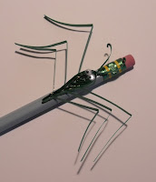
What elementary school student wouldn't love to use one of these pencils to complete their school work? Boys and girls alike would find their work a little more fun when sporting one of these insects on their writing tool. For that matter, adults might too!
Quilling thin strips of paper into circles of different sizes is an easy, repetitive task. Squeezing those circles into other shapes that are glued together, produces designs of nearly anything imaginable. Wrap some thin strips around pins set in a cork board for a longer quilled shape.
It seems that this time of year, warm weather brings many annoying and creepy insects to the flower bed. I quilled some more tolerable bugs and critters to keep indoors. I adhered them to pencil tops for a useful and fun decoration. I added some tiny google eyes and these little creepy crawlers came to life. I also used my fingertip to spread some stickles all over the sides of these quilled bugs for some special shimmer. (As always just click on a picture to enlarge it for a closer view.)
For the little guys, here's a creepy spider. . .
and praying mantis. . .
The gals might prefer this ladybug. . .
or this dragonfly. . .
How about reaching for a pencil with this little mouse running to the end?
This fuzzy caterpillar took a little longer to make and it was definitely worth the time and trouble. A fringing tool cuts the edge of very thin paper strips. When those cut strips are layered and fluffed, the most awesome caterpillar appears. . .
A basic quilling kit consists of a small slotted tool, thin paper strips, and a small bottle of all purpose glue. It's very helpful to have a quilling board for sizing small circles. There are other helpful tools like a cork board and pins, a fringer, a husker, etc., and if you find that you like quilling, then they're worth the investment. All of those items will fit into a container smaller than a shoe box so it makes a great traveling companion for us papercrafters who like to keep our hands busy.
There are several great quilling artists who have authored picture books to inspire your quilling creations. Quilling projects look fabulous on cards, scrapbook pages and other papercrafting projects. These special handmade pieces add pizazz to projects that always seem to get a great big "Wow!" reaction. That's always a good thing "in my book."
Quilling thin strips of paper into circles of different sizes is an easy, repetitive task. Squeezing those circles into other shapes that are glued together, produces designs of nearly anything imaginable. Wrap some thin strips around pins set in a cork board for a longer quilled shape.
It seems that this time of year, warm weather brings many annoying and creepy insects to the flower bed. I quilled some more tolerable bugs and critters to keep indoors. I adhered them to pencil tops for a useful and fun decoration. I added some tiny google eyes and these little creepy crawlers came to life. I also used my fingertip to spread some stickles all over the sides of these quilled bugs for some special shimmer. (As always just click on a picture to enlarge it for a closer view.)
For the little guys, here's a creepy spider. . .
and praying mantis. . .
or this dragonfly. . .
How about reaching for a pencil with this little mouse running to the end?
This fuzzy caterpillar took a little longer to make and it was definitely worth the time and trouble. A fringing tool cuts the edge of very thin paper strips. When those cut strips are layered and fluffed, the most awesome caterpillar appears. . .
A basic quilling kit consists of a small slotted tool, thin paper strips, and a small bottle of all purpose glue. It's very helpful to have a quilling board for sizing small circles. There are other helpful tools like a cork board and pins, a fringer, a husker, etc., and if you find that you like quilling, then they're worth the investment. All of those items will fit into a container smaller than a shoe box so it makes a great traveling companion for us papercrafters who like to keep our hands busy.
There are several great quilling artists who have authored picture books to inspire your quilling creations. Quilling projects look fabulous on cards, scrapbook pages and other papercrafting projects. These special handmade pieces add pizazz to projects that always seem to get a great big "Wow!" reaction. That's always a good thing "in my book."
Wednesday, July 7, 2010
Mini Clipboard Photo Display Easel
I've had so much fun decorating these mini clipboards distributed by Nicole Crafts. They're made of unfinished wood with an easy to remove metal clip. There is a metal insert on the back that can be used for wall hanging. A dowel is included so it can be used as a standing easel too.
I picked up some 3.5" x 5" acrylic photo frames (magnet on the back) to protect my photo and embellishments from dust and handling. It's a good fit and allows me to use my mini clipboard for writing on too.
This mini clipboard easel is handy for holding lists for groceries, crafting supplies needed, and other notes that I scribble on post-its. It's also a good memory frame for holding photos of some of my favorite people.
To prevent painting the metal parts, I remove the clip simply by unscrewing the bolts on the back.
I decorated this purple mini clipboard by first applying the solid color using Eggplant paint dabber directly over the wood. I used a sea sponge to dab some pearl alcohol ink with blending solution over the dry paint. I stamped the saying using distress black soot. Flowers were stamped using distress black soot and milled lavender. I stamped another flower using distress embossing ink then embossed it with lavender embossing glitter. I used golden rod stickles for tiny dots around the photo and some of the flowers. I also dotted some flower centers with lavender stickles. The frame was die cut using a Sizzix die and the photo was adhered behind the frame.
Decorating these mini clipboard photo display easels has allowed me to experiment with different techniques and try to achieve different looks. I'm happy with the results. Printing color photos in black and white is a nice change. Color photos look great too. Different shapes of frames are as appealing as using masculine and feminine die cuts and punches. It's possible to achieve a dimensional look even when the surface has to remain flat. This is a useful and functional item that holds photos, provides a surface for writing and keeps lists of needed items and other important information in an easy to find place. It's all good . . .
I picked up some 3.5" x 5" acrylic photo frames (magnet on the back) to protect my photo and embellishments from dust and handling. It's a good fit and allows me to use my mini clipboard for writing on too.
This mini clipboard easel is handy for holding lists for groceries, crafting supplies needed, and other notes that I scribble on post-its. It's also a good memory frame for holding photos of some of my favorite people.
To prevent painting the metal parts, I remove the clip simply by unscrewing the bolts on the back.
I decorated this purple mini clipboard by first applying the solid color using Eggplant paint dabber directly over the wood. I used a sea sponge to dab some pearl alcohol ink with blending solution over the dry paint. I stamped the saying using distress black soot. Flowers were stamped using distress black soot and milled lavender. I stamped another flower using distress embossing ink then embossed it with lavender embossing glitter. I used golden rod stickles for tiny dots around the photo and some of the flowers. I also dotted some flower centers with lavender stickles. The frame was die cut using a Sizzix die and the photo was adhered behind the frame.
Here's how the base of the clipboard looks without the acrylic frame clipped over it.
The acrylic frame doesn't lessen the sparkle of the glitter here:
Here's a similar background with a crackle stamp added to the surface:
I added glitter to some stamped shells for a light embellishment for this playful photo of my daughter running in the ocean.
Here's another cool look using army colors and my attempt at creating a camouflage effect for a clipboard display that holds a picture of my sister's son, a fine soldier, and a pretty cool nephew too.
Sizzix die cut frames, scalloped rectangle or oval, fit nicely into the acrylic frame.
The small die cuts and punches work nicely for layering coordinating embellishments in small areas.
Decorating these mini clipboard photo display easels has allowed me to experiment with different techniques and try to achieve different looks. I'm happy with the results. Printing color photos in black and white is a nice change. Color photos look great too. Different shapes of frames are as appealing as using masculine and feminine die cuts and punches. It's possible to achieve a dimensional look even when the surface has to remain flat. This is a useful and functional item that holds photos, provides a surface for writing and keeps lists of needed items and other important information in an easy to find place. It's all good . . .
Saturday, July 3, 2010
Copic Creations Birds Challenge
I've spent some time creating Copic backgrounds after seeing some of the entries for the Copic Creations Birds Challenge (here). I discovered Crissy Armstrong's video on dotted backgrounds (here) and had to play. We've practiced stippling during a couple of my Copic classes and this is a cool spin on that technique.
Tiffany Doodles is sponsoring this challenge. Tiffany Richards creates stamps based on images from her own photographs. She has some really beautiful bird images. I'm using a Goldfinch image from a set of EK Success Martha Stewart stamps that I already have in my stamp collection. The Goldfinch is the New Jersey State Bird so it seems appropriate that I should focus on creating a card using this beautiful native bird.
There are at least 9 different Copic techniques used in my entry for this challenge. How many of them can you name? If you've taken any of my Copic classes, you'll recognize at least some of them as we have gone into detail about and repeated many of them. This is a perfect example of why you need to know about the many ways to use Copic markers and why it's important to practice using those techniques.
I filled this image then used some of the same colors to create the background dots in this version:
I felt as though that might be a little too bold and took away from my Goldfinch.
So, I tried to lighten the dotted background by using the 00s of the same color families in this version:
Oh, I think that's much better. The effect is there and the background is much softer and subdued. I like that version. Then I tried to use a sky-toned outline shadow in this version:
I like that too but it wasn't exactly giving me the speckled kind of natural background that I think a Goldfinch would have if it were resting on a tree branch. I decided to airbrush, using the same colors as I used to fill the image, with the addition of violet as the contrasting color to the yellow in the Goldfinch. This is the version that I adhered to my card:
So take a good look at all 4 versions and see if you can find where these 10 different Copic techniques were used:
1. 3-Tone Smooth Blending
2. Deliberate Streaking
3. Opaque White
4. Outline Shadow
5. Airbrushing
6. Stippling
7. Fading with Lighter Color
8. Fading with Colorless Blender
9. Tip-to-Tip Blending
10. Pushing Designs
Labels:
cards,
Copic Airbrush,
Copic Creations Challenge,
Copics,
Spellbinders,
Technique
Subscribe to:
Comments (Atom)


