Why Rosie's Book?

While growing up, I had a dear friend, Renee, that lived next door and with whom I spent much of my childhood. We grew, in different directions, and went on our merry way. Many years later, I ran into her parents and they kindly reminded me of the laughs they still have over my book. “What book?” I wondered with a puzzled look. "I don't remember a book." Hardy laughter accompanied their response. At some time during our childhood, I tried to convince Renee about something that her parents didn’t agree with. I told her that proof of its truth could be found “in my book.” Naturally she went home and tried to convince her parents of the same thing but they weren’t falling for it. She needed an edge and told them emphatically, “It’s in Rosie’s book!” After they caught their breaths from reborn laughter, they let me know how “Rosie’s book” has been cited for many other things throughout the years. They’ve also mentioned that they’d like to see “Rosie’s book” one day. I can’t remember all of the things that I said were in “my book” but I’m sure my dear friend’s parents can recall much more than I ever knew about – LOL!!! So, here it is . . . my version of things you might find In Rosie’s Book . . .

Friday, May 28, 2010

Cool Tool for Copics Too! - Color Catcher

I've been having a blast decorating my Clearsnap Color Catcher. It's designed to be used with Smooch Spritz and other splatter spray products and I know it'll help me to be "greener" when using my Copic airbrush system too. I'll have less paper trash from protecting work areas and won't need paper towels for cleaning up. The Color Catcher is a cardboard spray booth that protects your project work area from over spray. There's no need for clean up. Yay!

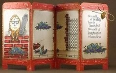
I've decorated my urban graffiti color catcher as inspired by Diana Kovacs of HamptonArt (find a great you-tube "how to" here). I love that I could use acrylic paint, stamps, ink and cut-n-dry foam that I already had in my papercrafting stash too! Yay! The more spritz, spray and splotches, the more authentic it will look. When I'm not spritzing or spraying, then it can hold other stuff. It's all good.

I used Design Master Primer spray paint over the entire cardboard for my gray base coat.

I cut a 1" x 2 1/2" rectangle of Inkssentials cut-n-dry foam. (If I were going to make another, I'd cut a slightly smaller rectangle. Once the paint spread out, the brick was a little larger than the foam piece.) I cut another 1" x 1" foam piece to fill in the spots where a smaller brick was needed. I poured some Adirondack dabber paint (red pepper, cranberry, mushroom and espresso) onto a foam plate and began stamping my bricks on the outside walls first. After completing the outside, I moved to the inside walls of the booth. Every step of the way, my brick walls looked cooler. Adding each brick was fun!

Acrylic paint dries so quickly that I was ready to move on to the dripping splotches in no time. I diluted snow cap paint with water then just poured it directly onto the wall. I spread the paint around a bit with a sponge brush then just let it drip. While that was drying, I rinsed and reused the smaller square foam piece and added hopscotch squares to the floor.  A few quick dabs of pebble paint with a sea sponge added some neat dirty-looking speckles to my floor and walls.

I pulled out some stamps from long, long ago and some newer ones too. (My oldest son once asked: "How many stamps does one person need? LOL!!! To that I must quote Buzz Lightyear: "To Infinity and Beyond!" LOL!!!) I tried Colorbox Chalk ink, as suggested in the video. I found the color to be too faint and I'd rather have a bolder, more vivid image, especially since I know that it'll eventually be covered by spritz. I turned to my archival black ink for clearer images. Overall, I think the variation in the softness and clarity of the images adds to the authentic urban graffiti look.

I stamped the clock face onto plain grungeboard then hand cut the circle. I stamped the other side of the grungeboard circle too, just in case part of it shows from the back. I inked both clock sides with Peeled Paint Distress Ink then pierced a hole in the center. I attached the time piece and game spinner with a brad, through the clock face and back wall of the color catcher.

I was having so much fun that I felt like painting and splattering some more . . . but, for now, enough is enough. I'm happy that my urban graffiti color catcher turned out to be such a neat looking and very cool tool that I can use with my Copic airbrush system too.

How will you decorate your Color Catcher?

Monday, May 24, 2010

Copic Creations Monochrome Challenge

I've been teaching monthly Colors of Copics classes that involve using three Copic markers, from the same color family, to apply color using various techniques.  There are so many different looks that you can get from just three Copic markers!  So as soon as I saw this month's Copic Creations challenge, I knew I had to participate!

Here's a picture of a card that I submitted for the Copic Creations challenge:  Monochrome Copic Coloring (find the challenge here).  I don't have any of the Paper Makeup Stamps by the challenge's current sponsor, Katie Cotton, so I used a fairy image that I'm sure could work well with any color scheme.


I stamped The Rubber Cafe images (Woodland Fairy and Anything is Possible) using Memento Grape Jelly ink.  Bazzill Smooth cardstock worked nicely with Bazzill Bling and Worldwin DoubleMates Lovely Lilac.  I used Copic markers V0000, V000 and V01 for the fairy's wings and skin; V04, V06 and V09 for her dress; V91, V93 and V95 for her hair.  I used V12 to airbrush lightly around the image.  Colorless Blender faded her skin and wings to white.  atyou Spica Clear added magnificent sparkle to her wings and the flowy part of her dress.  Prima crystals added a little more bling to the border and image.  After using the Martha Stewart border punch, I like to set aside the remaining punched shapes to include as confetti for the inside of the card.   A thin Offray ribbon tied it all together.

Creating monochromatic projects using Copic markers, all from the same color family, allows you to apply various Copic techniques for added texture and dimension.  Give it a try!  You'll like it!

Thursday, May 20, 2010

Using Copics with Embossing Powder

I like using embossing powder (EP) over stamped images. I like how colored ink becomes more vibrant when embossed with clear EP. I like the look of variegated and enhanced EP, some with glitter inside for some extra glam. I really like how the simple shine of slightly raised lines makes my stamped images look special. Using EP for emboss resist is fun too.

Here, Doegy the Dragon was stamped with Versafine pigment ink, embossed with black detail embossing powder, then filled using Copics. The Pear image, stamped with Memento Cottage Ivy, was embossed with clear embossing powder then filled using Copics. The embossed image lines remain slightly raised and shiny.


During a recent Copic class, as we began discussing use of Copics with embossing powder, a student remarked that she heard that Copic markers “eat” embossing powder. I found that to be interesting. I’ve been able to use embossing powders and Copics together to create some really nice backgrounds and completed images and haven’t found my embossing powders to suffer from hungry Copics.

So, I decided to try some different brands and colors of EP to find out what happens.

I heat-embossed the same leaf image using six different brands and colors of embossing powder. For consistency, all images were stamped using Versa-Mark on Bazzill Smooth cardstock, and then I used Copic marker colors Y04 and Y08. On the right side of each image, I deliberately dragged the marker tip over an embossed area and every time the marker smeared the color of embossing powder. In all cases, the embossed lines that the marker touched were no longer raised and the sheen of the embossing powder was removed. On the left side of each image, I was careful to avoid touching the marker tip to the embossed lines. I found that as long as I avoided dragging the marker tip over the embossed lines, I could fill my image without any ill effects.

So, there you have it. If the marker tip touches the embossed areas, the color of the embossing powder will smear into your image. Just for fun, I held the marker tip over an embossed line for a few moments and when I removed it, the embossing powder appeared to have a “bite out of it.” LOL!!! Despite my findings, I think I’ll keep using Copics with embossing powder, albeit very carefully, on open images. You can too. I think the answer is very simple:  If the Copic marker tip, when held in place over the embossed lines, “eats” the embossing, then don’t do that. LOL!!!

To use Copic markers to fill images that have been heat-embossed – Fill the image using your favorite technique. Remember that even though the embossed lines are raised slightly over the paper, color can still bleed and feather beneath these lines. Be kind to your image and avoid dragging the marker tip over the embossed lines as the alcohol in the marker may react with the embossing and cause colored streaks throughout your image. All in all, alcohol-based Copic markers can work beautifully with heat-embossed images when applied properly.

To use Copic markers for Embossing Powder Resist - Heat-emboss an image using clear or white detail embossing powder. Apply dark marker color to cover the entire area (by quickly swiping chisel tip directly on paper or airbrushing). Dampen paper towel with colorless blender. While the colored area is still wet, wipe over the embossed area with a smooth section of the dampened paper towel. Swipe the towel softly over the embossed area to avoid scratches in the colored area. The colorless blender removes color from the resist areas. As the colored area and the colorless blender solution dry, the colored area may show signs of a marbling texture.

Sunday, May 16, 2010

Copic Techniques: Stippling and Deliberate Streaking

The ability to produce 3-Tone Smooth Blending is likely the top reason that Copic markers have become so well-loved by Stampers. Stamped images can become more realistic and sometimes absolutely stunning with layers of smoothly blended shading. Layering various shades of color using these markers doesn’t cause the paper to pill or leave streaking in your images! Hooray for Copics!

But what if your images need streaking? Sometimes the most appropriate coloring for your image is spotty and streaky. If you use that beloved 3-Tone Smooth Blending, well then, your image may not look very realistic at all. Oh, it’s pretty and it looks nice. Then, sometimes it’s just too perfect and well, it becomes kind of unnatural-looking and perhaps even less interesting.

So let’s fix that! We’re going to add our very own 3-Tone Spots and Streaks. And, yes, we’re going to do it with the markers that have become highly sought after for their superior qualities meant to prevent streaks and spots. (Uh oh! The rebel is coming out in me. Some call it a poltergeist. Some call it “the other woman.” LOL!!!) Really, there are just some images that demand spotting and streaking for a more realistic and natural look. Ready? Let’s do this thing!

The first pumpkin image is filled using 3-Tone Smooth Blending. Looks nice, right? But it’s a whimsical pumpkin, and pumpkins have natural rib indentations that we can exaggerate by using streaks. The second pumpkin image now looks more natural and interesting. What do you think?


This open image of a wooden sign needs to look like a piece of wood. Select 3 Copic earth tone-colored markers. In the direction of the grain, fill the image using strokes of your lightest color. (You can use the brush or chisel tip of the marker.) Streak in some medium color lines (some thin, some thick). Lightly add the darkest color, still streaking in the direction of the grain. Add some of your lightest color back in between the grains. If you want your image to appear weathered, now streak in some gray. If you want your image to appear bleached, like a piece of dried driftwood, then now streak in some colorless blender. This sign has some natural highlights, shading, dimension and it looks more like a wooden sign than if it were smoothly blended.  (Find out more about coloring things to look like wood at Marianne Walker's blog here.)

This stamped image of a bare tree branch needs some Spring blossoms. Select 3 Copic markers: a dark, medium and light color. Using the brush tip of your darkest color, create a 3-dot triangle at each limb’s end. Use the medium color to create a 3-dot triangle around each dark dot. Use the lightest color, wherever possible, to create a 3-dot triangle around each medium dot. Do you see how you’re building your blossom from the inside out? Remember that light pushes dark, so place a single dot of your lightest color over your darkest dotted areas. Finally use a coordinating atyou Spica to dot over your lightest areas to add some amazing sparkle. These Spring blossoms are not smoothly blended and they shouldn’t be. This image has some natural highlights, shading and dimension, even some glassy shimmer. It’s just right.


Try these techniques with other images. Give your naked winter tree images some summer leaves. Let your beachy wood pilings appear to be made of wood. Stamp your images of beach chairs, picnic tables, bushes, and hyacinths. Use your Copic markers to streak and stipple them. Compare them to images you’ve filled using 3-Tone Smooth Blending. Which images look more realistic to you? Let me know what you think.

Wednesday, May 12, 2010

Copic Technique: Fading with a Lighter Color


Fading with a Lighter Color has become a favorite Copic technique for some of my students, so I think that it warrants some special attention. This technique allows use of just two Copic markers to create a very soft, velvety, muted color that has plenty of texture and shaded dimension. As you can see in the completed images, the Fading with a Lighter Color technique can be used with a variety of color combinations. I really want for you to try it on your own. It may become one of your favorite ways to use Copics too.

Fill the image first using a very dark color, at least two shades darker than you really want the image to be. A color with a 7 through 9 as the last digit is perfect for this. That last digit indicates the color value (light to dark). A marker color with the last digit as 0 is very pale while a 9 is dark because a lot of gray is added to the color to make it darker.

Choose a lighter color as your fader. A color with the last digit of 5 or lower will work nicely for this. It is not important that this lighter color have the same first digit, just make sure that the last digit is 5 or lower.

While that dark base color is still a little wet, color over it with your lighter color. Begin by holding the brush tip of your lighter color in the center of the image area. Work in small circles that get wider toward the edges of the area. You don’t want to push all of the dark base color outside of the lines of your image so leave a narrow edge of your original color in place around your image lines.

This technique demonstrates the use of a lighter color as a fader. When the tip of the lighter color is used over damp, dark marker color, the wet lighter color will fade the darker color away and allow a very soft, velvety, muted color to show through.

Neat, huh? Let me know if you’ve tried it. Share your images. I’d love to see them. Would you have thought of using this technique if I hadn’t mentioned it? Try using the Colorless Blender as a fader this way too.

Saturday, May 8, 2010

It's our pleasure...

What a beautiful, invigorating, and exciting set of words . . . It's our pleasure...
That's how a letter I received today from Scrap&StampArts began. Surely the rest of the letter could only be wonderful.

So what if the letter wasn't especially addressed to me. The envelope was. So what if the letter is a generic template. It still applies to me and it makes me happy.

I'd forgotten about a card that I submitted nearly three months ago for an upcoming publication. I flipped furiously through the pages of my July 2010 complimentary copy to find the picture of my card.

Wow! Yep! It's really there. Wait! Yep, the caption is correct. That's so cool!
I have to look at it again.

Does something like that ever get mundane or boring? Does anyone ever get a letter like that and not feel like jumping up and down?

I'm still basking in the total coolness of having something I made show up in an official publication. It was, after all, my first submission. I think I shall go, right now, to make something else . . .


Published in July 2010 Scrap&StampArts