Why Rosie's Book?

While growing up, I had a dear friend, Renee, that lived next door and with whom I spent much of my childhood. We grew, in different directions, and went on our merry way. Many years later, I ran into her parents and they kindly reminded me of the laughs they still have over my book. “What book?” I wondered with a puzzled look. "I don't remember a book." Hardy laughter accompanied their response. At some time during our childhood, I tried to convince Renee about something that her parents didn’t agree with. I told her that proof of its truth could be found “in my book.” Naturally she went home and tried to convince her parents of the same thing but they weren’t falling for it. She needed an edge and told them emphatically, “It’s in Rosie’s book!” After they caught their breaths from reborn laughter, they let me know how “Rosie’s book” has been cited for many other things throughout the years. They’ve also mentioned that they’d like to see “Rosie’s book” one day. I can’t remember all of the things that I said were in “my book” but I’m sure my dear friend’s parents can recall much more than I ever knew about – LOL!!! So, here it is . . . my version of things you might find In Rosie’s Book . . .

Monday, August 16, 2010

Using Copics for Copper Metal Things

I’ve come across some images that beg to be filled with colors depicting precious metals and other commonly known metals. There’s the heavy cast iron of a witch’s cauldron. How about the cold shiny steel of King Arthur’s sword? Flower arrangements are lovely when sitting in an old country kettle. What colors shall I use to fill an image of intertwined wedding rings and holiday bells?  What do you use when the music hits you and your project includes an image of a musical instrument? The list goes on and on . . .

There’s a lot of thought involved in filling images of metal things. Sure, you could stroke on a layer of gray when you mean silver, or a layer of yellow when you mean gold. Then how will you convey that it’s metal without accenting the shadows and reflective qualities of the shiny surface with some highlighted gleam and shimmer? Making your images look more realistic demands that your metal things look shiny.

I want to match the color of this pretty watering can made of embossed copper that I filled with artificial greenery and other stuff.  Should be easy, right? Not at first.

Copic makes an E18 Copper marker. Naturally I reached for it first. It’s very, very dark and I’ll likely pick it up to use on copper things only if I want to add a very narrow area to my deepest, darkest shadows.

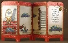
So, which colors will give me the copper I need? I started early in the day and began scribbling color combinations on scratch paper. Only the highest quality scratch paper will work for this – LOL!!! I used left over scraps of the good stuff to get the right color action. After more than two dozen tries, with breaks in between to allow drying time, I finally found a combination that works for me.

E33, E37, E39 Highlight with E02
Copper has a reddish-orange metallic luster. I sought the deep shadow and medium tone of copper with a rosy-peach highlight that best matched my copper watering can and best suited the colors found in a shiny new penny. Here’s what I came up with. Let me know what you think of the colors? When you first see it, do you immediately think, “well, of course that’s copper?”

Now that I've got the colors right, I think I need to find a way to make it shine a little more . . .

If you try my Copic copper metal combination, please share your image with me so I can see how it looks. If you use your own combination, please share that too!

1 comment:

Unknown said...

some times it takes so much time playing the blendy game to get the color or effect you want! I have done that and it only took 10 minutes to make the card but all day to color it! :).
Just getting back into creating, bought a few new stamps, hopefully the new Hero line will be in this week, there are a few I like.
See you soon,