I generally use patterned paper in very small doses. When I find a patterned paper that absolutely thrills me, a strip of it here and a piece of it there is enough for me. Some designers make incredibly beautiful paper that I love to look at in full sheets and talk about how pretty it is. There are rare occasions when I let the patterned paper bug bite and I show an obvious infectious reaction.
Here's one of those times . . .
The Scrappers Cove layout challenge kit for October included double-sided patterned paper from the Echo Park Happy Halloween collection: jack o'lantern and haunted house. Whew! They're really very busy patterns. Sweet, but busy. My kit also contained Bazzill orange and purple cardstock and a bottle of Ranger's lettuce acrylic paint dabber.
As if that weren't enough, I added some shimmering black sugar paper, a metal web/spider brad set and some ribbon. Then I got busy . . .
I set my layered layout on top of a 12x12" magnet sheet and secured a couple of Tattered Angels Glimmer Screens Fanciful Stencils flourishes to the top of my layout background with small magnets. I used my Copic airbrush system with a Black 100 marker to lightly outline my flourishes, allowing parts of the flourish to extend beyond the edge. That was easy!
I guess I should add some photos - LOL!!! This very busy layout holds eight photos. I left more “white space” in the area that surrounds the larger focal point photo to allow a place for weary eyes to rest.
Ranger’s Lettuce acrylic paint dabber outlines the b-o-o. Now that's just plain ol' fun to use Heidi Swapp alphabet masks and just swoosh paint all around the letters. The paint dries in a flash. The letters clean up easily. The impact is phenomenal.
I feel the need for MORE. I cut two 12x1” strips of jack o'lantern paper to create the rosette by hand. Folding this way and that way, accordion style, to the end of both strips then adhered the ends of both strips together. Squished it toward the center and pressed it to a glue dot to secure. Nice. Don't forget to add some ribbons!
Done yet? There's only room for a smithering of journaling and I must date the photos. Ooh, wait, a chipboard ghost should flow out of the chimney. Yes, now it's done.
It sure was fun to put this layout together . . . it's like a costume party, all wrapped up . . .
Wednesday, September 29, 2010
Saturday, September 25, 2010
Inspiration from the Masters - Tim Holtz Holiday Tag Art
I'm lucky.
Today I spent some time with a fabulous group of paper crafters who continue to seek creative inspiration from the Best of the Best.
Using some of Ranger's most popular products, we put together these fabulous pieces of tag art. Mario and Michelle had all of the prep work done and the kits bagged. Then, Tim Holtz, in his own special way, provided step-by-step instructions on how to put all of the pieces together.
Scaredy Cat
Dash Away All
Winter Wishes
Grunge board and paint, inks and stamps, metal, stickles, ribbons and die cuts . . . what a wonderful way to get in the holiday spirit!
 |
| Mario, Rose and T!m |
Tuesday, September 21, 2010
Card Art Kit Challenge: Magnolia Tilda vs. Tim Holtz Grunge
My latest project includes new items for me. A Magnolia Tilda image, grunge card art materials, and X-Press It blending card.
First of all, the Scrappers Cove now carries Magnolia stamps. YAY!!! I’ve been admiring these wonderful images from Sweden for years and I’m thrilled to actually touch these stamps. With 28 designs to choose from, I eventually walked away with just 7 of them. The first one I picked up was playful little Tilda enjoying herself among a pile of autumn leaves. (That’s what I want to do when I grow up – just play in a pile of leaves. LOL!!!)
The Cove also had their October card art challenge kit ready so I picked that up too. Uh oh. Take a look at what I have to work with this time. LOL!!! 2 sheets of Tim Holtz Idea-ology double-sided patterned paper with a sheet of Bazzill. A strip of a green hemp braid. 5 pieces of Tattered Angels glimmer chips. One of T!m’s token charms. A bottle of Fired Brick Distress Stickles. Hmmm. It’s all so dark and grungy.
I really want to use one of my Magnolia images. I can’t wait to ink one and see what I can do with it. Can I use Tilda in the Autumn Leaves? Dare I “grunge” her up? I envisioned my first Magnolia surrounded by frilly lace and glittering flowers with jewels and other lovely girly things. What to do? What to do? Another Copic dilemma.
The Scrappers Cove has recently received an order of the X-Press It blending card and kindly gave me a bit to try. I went ahead and stamped Tilda using Memento Tuxedo Black ink. Wow! What a nice, very fine lined image - the first time! If all Magnolias stamp so smoothly, I think I’m gonna love using them.
I referenced my handy-dandy Copic color chart to find coordinating markers for the T!m paper. The more I looked at Tilda, the more I thought that she needed to be inside the shape of a circle. I can give her a little bit of lace by using the Spellbinders Lacey Circle dies. I used a QuicKutz 3 ½” circle and cut beyond the edge of her hand and some of the leaves. (Find other samples of die cutting beyond the edge here and here.)
I began to fill my Tilda image by isolating sections and coloring them one at a time. The entire piece will come together as a cohesive whole. This is a good method to practice no matter which image you’re working on. It allows you to keep enough juice in your paper when you need that moisture to allow the colors to blend properly.
I can’t tell you that I noticed the X-Press It paper working differently than the Bazzill Smooth or Neenah, while I applied my colors. I did slip with my darkest blue and added color outside of the line of the image, where I didn’t want it to be. When I used the colorless blender to try to push it back inside of the line of the image, the X-Press It did NOT clean up as easily for me. I was a little disappointed. I “slip” often enough that it’s very important for me to be able to easily push unwanted color back inside of my image. I’ll have to give this paper another test, another time.
I stippled into the open areas of the pile of leaves to continue the color pattern of the more shapely leaves. A touch of distress stickles lines some leaves.
When Tilda and the leaves were completed, I masked Tilda, placed her back into the circle die and began airbrushing: a little Y13 directly surrounding her, a very light B91 for sky around the die’s edge. I used the brush tip to airbrush speckles of YG95, E29, E09 and Y28 into and around the pile of leaves with more of the YG95 to represent autumn grass color at the bottom of the circle’s edge. I’ll tell ya’, when I removed that die and mask, I fell in love with my first Magnolia Tilda. She’s perfect to me. I had a little tear in my eye.
I feel like she’s got the right autumn colors and I know she coordinates with the T!m “grunge” papers. I think she can hold her own. Yet, I still feel the need to protect her from T!m’s DIRT. LOL!!! She is, after all, my first Magnolia . . . even if she’s rolling on the ground, in leaves. LOL!!!
The lacey circle die spices up the T!m “grunge” just enough to keep Tilda sweet. I have to use the T!m metal token but if I hang it from the playful word ticket then Tilda is still ok. I’ve added an autumn colored grunge paper rose that shimmers with rock candy stickles. Hemp is a little rough but makes a nice border. I’m not sure what to do with this piece of glimmer chip so I’ll give the rose a base. Whew! The strong opposition between T!m’s grunge-look and my wish for a delicate-looking Tilda is exhausting!
I’ve formed all of this into a pop-up card because they’re just so much fun.
Here’s the card front . . .
Here’s the inside . . .
Now, don’t get me wrong. I do LOVE T!m’s grunge, for some things. His products are exceptional, his work is extraordinary and he is a magnificent artist and person. I will continue to support his artistic adventures by purchasing his products. I simply didn’t expect to introduce my first Magnolia to his products so quickly. LOL!!!
Does anybody else think that maybe, just maybe, I've taken this challenge a little too seriously? LOL!!!
Copics used:
Jeans: B91, B95, B97, 0
Shirt: YG91, YG93, YG95
Skin: E000, E00, YR00, R20
Hair: E25, E27, E29, 0
Socks: B00, 0
Leaves: E13, E15, E17; E04, E07, E09; Y13, Y26, Y28
Labels:
cards,
Copic Airbrush,
Copics,
Handmade Flowers,
Magnolia,
Spellbinders,
X-Press It
Friday, September 17, 2010
Copic Creations Shading Challenge
The Copic Creations Challenge team is promoting the fabulous qualities of Copic markers with their latest challenge to shade on and/or around images. (Find the challenge here.) Copic markers provide users with the ability to add darker shaded areas that can be smoothly blended with base colors for more realistic-looking images.
Kraftin' Kimmie Stamps is sponsoring this challenge and one participant will be randomly selected to win two of their images. Their slogan is "Whimsical Rubber Stamp Images That Make You Smile." After viewing the Copic Creations Design Team samples using these images, I found myself laughing over each one.
I've used a Spellbinders Blossom die and cut a Motivet Dexter with Christmas Gift image beyond the edge of the gift (see another example of this die cut technique with a fairy's wing here).
The stamp artist added some crosshatching at the base of the image to indicate shadows. I filled my image and deliberately placed some of the same colors at the base of each object to show some colored shading in those places. I don't think I care for that messy look and will try to find another way to use that crosshatched shadow area.
Working with layers and layers of these wonderful papers of Christmas candy designs and colors inspired me to make good use of a few of my punches and create some fun poinsettias to add to my card.
I punched red, white and green Bazzill cardstock to coordinate with my card using punch bunch kikou, tiny sun and holly leaf punches.
The punched pieces are all very flat and need some "fluffing." Placing each piece, upside down, on a soft rubber mat, I used an embossing tool to rub the back of each piece in a circular motion to make it curl.
Turning the pieces over, so the textured side is up, I used the embossing tool to push down just the center of each piece to form it further. I tried to emboss a line at the center of each of the holly leaves to provide a little more texture there.
Just a dab of glue to hold the pieces together, a dot of Stickles golden rod at the center and I've got a handful of handmade flowers to cluster together on my card.
Here's the completed easel-style card showing marker-to-paper shading on my Dexter image and airbrushed shading around my image.
At this pace, I may have two Christmas cards ready to mail in December. LOL!!!
Kraftin' Kimmie Stamps is sponsoring this challenge and one participant will be randomly selected to win two of their images. Their slogan is "Whimsical Rubber Stamp Images That Make You Smile." After viewing the Copic Creations Design Team samples using these images, I found myself laughing over each one.
I've used a Spellbinders Blossom die and cut a Motivet Dexter with Christmas Gift image beyond the edge of the gift (see another example of this die cut technique with a fairy's wing here).
The stamp artist added some crosshatching at the base of the image to indicate shadows. I filled my image and deliberately placed some of the same colors at the base of each object to show some colored shading in those places. I don't think I care for that messy look and will try to find another way to use that crosshatched shadow area.
I punched red, white and green Bazzill cardstock to coordinate with my card using punch bunch kikou, tiny sun and holly leaf punches.
The punched pieces are all very flat and need some "fluffing." Placing each piece, upside down, on a soft rubber mat, I used an embossing tool to rub the back of each piece in a circular motion to make it curl.
Turning the pieces over, so the textured side is up, I used the embossing tool to push down just the center of each piece to form it further. I tried to emboss a line at the center of each of the holly leaves to provide a little more texture there.
Just a dab of glue to hold the pieces together, a dot of Stickles golden rod at the center and I've got a handful of handmade flowers to cluster together on my card.
Here's the completed easel-style card showing marker-to-paper shading on my Dexter image and airbrushed shading around my image.
At this pace, I may have two Christmas cards ready to mail in December. LOL!!!
Monday, September 13, 2010
Layout Challenge: KI Memories Posh Plus
Using multiple photos on a single page layout takes some work. Once you select your focal point photo and supporting photos, you need to find a way to make your focal point photo stand out from all the rest.
For this layout I've opted to draw attention to my focal point photo in three ways:
it's larger than the others,
has been popped up,
and an embellished photo corner has been added to it.
I've added six smaller supporting photos. That's a total of SEVEN photos on a single page layout!
This double-sided patterned paper is from the KI Memories Posh collection: etiquette and vineyard. I've used a coordinating decorative brad and two foam stickers from the same collection. The brown and light aqua cardstock is from Bazzill. A single line of Star Dust Stickles adorns the photo corner. All of this was part of my September Layout Challenge Kit from the Scrappers Cove.
I've shown all sides of the patterned papers by using some as a border strip, a grounding strip for the title, a large layout matting as well as matting for each of the photos.
The border strip of flowers begged for shimmering jewels:
The two tones of My Little Shoebox Sprinkle Glaze Alphabet Stickers in Ocean and Lagoon were perfect for the title of this layout! (Thanks again, Bethany!)
I've left a border around three edges of the layout's base for handwritten journaling with a fine tip Micron brown marker:
"Spending 17 hours, on a bus, without anyone I knew, back and
forth from Las Vegas, for just 2 hours of site seeing at the North
Rim and South Rim of the Grand Canyon, was worth every single
minute! It is magnificent!!!"
Here's a pic of the full seven photo single page layout:
It's been quite some time since my bus trip to see the splendors of the Grand Canyon. I've enjoyed revisiting that special place, through these pictures.
Thursday, September 9, 2010
More About Using Copic Fluorescent Markers
The Dorland’s Medical dictionary defines fluorescence as the property of emitting light while exposed to light, the wavelength of the emitted light being longer than that of the absorbed light. The current eight colors of Copic fluorescent markers do just that! Copic fluorescent ink shines brightly when exposed to ultraviolet light!
For us non-scientific folks, Neon is a gaseous element, known to give off a reddish-orange glow under some circumstances, and teensy, tiny, no-worry amounts can be found in the air and some electric lamps. Copic fluorescent marker colors can appear to glow but they are not gaseous. I mention this because I need to stop referring to Copic fluorescent colors as being neon. (I expect that one of my Copic class students, Christine the Chemist, will be happy to learn that I’ll try not to use that term so lightly anymore. LOL!!!) It’s just one more syllable and another seven keystrokes to complete the word “fluorescent.” So be it.
I wanted to see which combination of these fluorescent shades would produce the most nicely blended, yet knock-your-socks-off, filled image. I also like to see the results, for comparison, very near each other on the same project.
This Dover Digital Image of three parrots among branches of a rose tree did the trick. This also allows me to show use of regular Copic colors mixed with the fluorescent colors in the same image. Parts of this image are smaller and tighter than I like to work with. I thought that I might have to use a lot of tip-to-tip and/or pallet blending to provide the needed shading in those 'one-stroke-is-all-you-get' areas. A light touch with the very top of the brush tip was all I needed.
My favorite wood colors for branches are E31, E35 and E47. My favorite colors for filling roses are R22, R29 and R59. G82, G85 and G99 are wonderful dull greens for leaves. W5 and W7 with 0 for highlights worked nicely for the beaks and claws.
Following are closeups of my attempts at three different marker combinations using Copic fluorescent colors. The Copic color coding system seems a little skewed on these but don’t let that deter you from the happiness these fluorescent shades can produce. Four colors (code with digit of 1) are brighter and the other four (digit of 2) are slightly duller.
FRV1 Pink, FYR1 Orange
FYG1 Yellow, FY1 Yellow Orange, and FYG2 Dull Yellow Green
FB2 Dull Blue, FBG2 Dull Blue Green, and FV2 Dull Violet
Find out more about using Copic fluorescent marker colors here and here.
 |
| Copic Fluorescent colors shown under a black light |
I wanted to see which combination of these fluorescent shades would produce the most nicely blended, yet knock-your-socks-off, filled image. I also like to see the results, for comparison, very near each other on the same project.
This Dover Digital Image of three parrots among branches of a rose tree did the trick. This also allows me to show use of regular Copic colors mixed with the fluorescent colors in the same image. Parts of this image are smaller and tighter than I like to work with. I thought that I might have to use a lot of tip-to-tip and/or pallet blending to provide the needed shading in those 'one-stroke-is-all-you-get' areas. A light touch with the very top of the brush tip was all I needed.
My favorite wood colors for branches are E31, E35 and E47. My favorite colors for filling roses are R22, R29 and R59. G82, G85 and G99 are wonderful dull greens for leaves. W5 and W7 with 0 for highlights worked nicely for the beaks and claws.
Following are closeups of my attempts at three different marker combinations using Copic fluorescent colors. The Copic color coding system seems a little skewed on these but don’t let that deter you from the happiness these fluorescent shades can produce. Four colors (code with digit of 1) are brighter and the other four (digit of 2) are slightly duller.
FRV1 Pink, FYR1 Orange
FYG1 Yellow, FY1 Yellow Orange, and FYG2 Dull Yellow Green
FB2 Dull Blue, FBG2 Dull Blue Green, and FV2 Dull Violet
Find out more about using Copic fluorescent marker colors here and here.
Sunday, September 5, 2010
Copic Creations Pleats or Folds Challenge
My new Colors of Copics class this month at the Scrappers Cove in Milltown, NJ, focuses on filling images of things that are black. When I saw the Copic Creations Challenge to use pleats or folds in clothing, I knew I wanted to elaborate on using the Copic toner gray color family for filling images of black cloth.
Stamping Scrapping is sponsoring this Copic Creations challenge and two random winners will receive either a Magnolia Tilda or Edwin stamp. Find out more about the challenge and Stamping Scrapping here.
I have printed this Dover Digital Image of the grim reaper on Neenah Classic Crest Solar White using my Epson Stylus Photo R1800 printer. As you can see in this pic of the image, the artist added very few lines to convey folds in the flowing cloth of the robe. I think I need more folds to meet this challenge. I began by filling the image smoothly using T0.
I added more folds to the cloth by first deliberately streaking a medium T6 as I attempted to follow the lines of the image. I added some deeper shadows to those folds by streaking a darker T9 next to and touching the medium strokes. Find more about deliberate streaking here.
Leaving very narrow areas along the edges of the robe untouched for highlights, it's necessary to fill the robe using the medium shade as a base color. This also helps to soften the edges of the streaks in the folds. I added some dark shading with T9 at the bottom of the robe as well as above and beneath the staff.
I used T0 and the colorless blender to add more highlights by using short, quick, very light, overlapping strokes in places along the edges of the robe. A great way to accentuate the highlight and control its length and width is to outline the highlight mark with the medium color.
This pic shows use of all four Copic Gray color families! Toner Grays (T0, T6, T9) fill the robe; Cool Grays (C1, C3, C5) fill the Scythe; Warm Grays (W1, W3, W5) fill the gravestones; Neutral Grays (N1, N3, N5) fill the wisps of fog above the gravestones. I love that I can see how different these Grays are and show why a Copic user must have all four Gray families to get the needed look! LOL!!!
Using a 1" circle punch and mask for the grim reaper, I used W3 and W5 to airbrush a spooky sky around the image. I airbrushed a little G85 around the base of the grassy area in my attempts to soften the transition there. I removed the masks and airbrushed a bit of YR07 in the center of the moon with a little Y13 at its edges. I laughed a little at the irony of using a ticket punch for the corners, then the more that I looked at it, the more uneasy I started to feel. I gave myself the creeps! Guess that's realistic enough for me! LOL!!! I better just add a sentiment and a bow and call it done.
Here's the completed card that shows how folds can be added to images of cloth using Copic markers.
Use this Copic Toner Gray combination to fill your images of a witch's black hat, a vampire's cape, scaredy-cats, hunting bats, etc. Add the Black 100 or Special Black 110 only if you want to add a very narrow area to your deepest, darkest shadows.
Labels:
cards,
Copic Airbrush,
Copic Creations Challenge,
Copics,
Technique
Wednesday, September 1, 2010
Card Art Kit Challenge: Easel Style Card
The Scrappers Cove in Milltown, NJ, has done it again! The owners of my favorite local scrapbook store have started a monthly card kit to help satisfy the papercrafting needs of their card making customers. Participants pay just $5 for a package containing products selected by the store then submit their completed card(s) for a chance to win a $25 gift certificate to be used at the Scrappers Cove. Completed cards are due by the 15th and a winner is randomly selected each month.
Participating in challenges this way is a fun and inexpensive way to try products and combinations that you might not normally choose on your own.
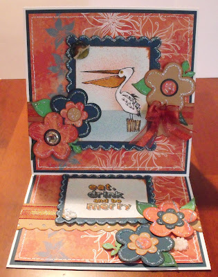
My kit contained Ruby Rock-It The Summerhouse Glow double-sided patterned paper, Bazzill cardstock in tan and dark teal, 4 buttons, Inkadinkado pelican clear stamp set, Memento Dew Drop Potters Clay, and a satin/sheer ribbon.
As soon as I saw these products, I thought I’d give my best shot at creating one of those lovely European-styled 6x6”ish cards that I admire so much. Here’s the easel card that I completed using the products from this card kit:
Easel cards are relatively easy to make considering how difficult they first appear to be and the magnificent impact of displaying them. While this is a 6x6”ish size, the same process applies to any sized easel card. (See my trashcan bear easel card here.)
Using a 12”x6” paper, score it at 6” and again at 3”. The 6” area becomes the inside base of your card. Fold the 3” score mark toward the inside base and it becomes the easel. Here’s a pic of how it’ll look:
Adhere a 6” square to the bottom inside half of the folded easel for your card front. Here’s a pic of how it’ll look:
Now that your 6” easel card is formed, you have a massive area to cover with all of the layers, images, embellishments and bling that your little heart desires. Your card front and inside base will both show when using the easel to display your card art. This card also folds flat for ease in giving.
One very important thing to remember for proper placement is that something near the top third of your inside base has to be “popped up.” That’s the crucial element that keeps your card front from sliding forward and sort of locks it in place for display. You can use foam or 3d glue dots to pop-up sentiments. A button or other embellishment with height will also work.
If you haven’t tried this card making style yet, what are you waiting for? Go for it! You’ll be so glad that you did.
Labels:
cards,
Copic Airbrush,
Copics,
Handmade Flowers,
Technique
Subscribe to:
Comments (Atom)


